.png)
.png)
The platform powers health plans and providers operating inside value-based risk arrangements. Its PCP dashboard gives physicians and health system leaders a unified view of provider performance, patient outcomes, and the gaps in care that quietly compound into financial risk.
I was brought in to redesign it. The brief was to modernize the UI and reduce support tickets. The actual problem was poor information hierarchy — decision-relevant data was buried where clinicians couldn't reach it.
Two structural conditions defined the work.
A dated interface eroding trust. The legacy UI looked older than the data it served. For a product positioned as a strategic analytics tool, that mismatch undermined credibility before users ever read a number.
An information architecture that demanded recall, not recognition. The PCP dashboard presents data at three entity levels — organization, practice, and provider. The legacy navigation rearranged itself dynamically as users moved between them. Drill into a practice, and the entire global navigation shifted underneath. Drill into a provider, and it shifted again. Users never built a stable mental model of the platform because the platform never stayed in the same place.
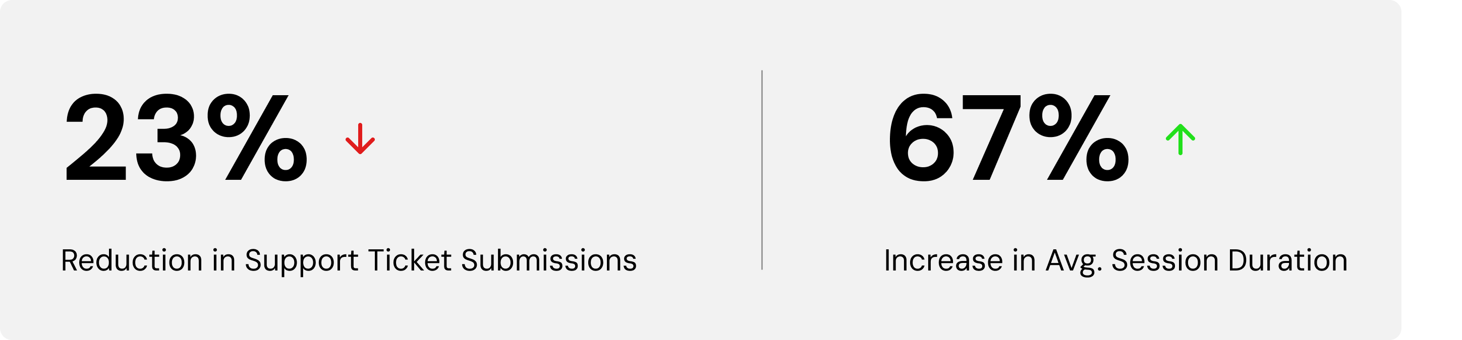
That instability had a cost the business could measure: support ticket volume.
The work began with a discovery session alongside the Product Director and Product Manager — clarifying the pain points the team already saw and the value they intended the redesign to deliver.
From there, I ran a market audit of comparable population health and clinical performance dashboards to establish what conventions clinicians already recognized, alongside an audit of the existing IA to catalog where the platform was reinventing patterns that didn't need reinvention.
A wireframe followed, presenting the team with a modernized UI direction and a simplified, static IA model. The Product Manager ran user interviews against the wireframe, returning findings on filter behavior, navigation friction, and the conventions clinicians expected. Those findings were folded directly into the high-fidelity prototypes.
Reducing the cognitive load that produced support tickets. Redundant data and visuals were eliminated. The palette was reduced and accessibility compliance (WCAG) enforced throughout. Hierarchy was rebuilt through typography — size, weight, and color carrying the structure the legacy UI had asked color blocks to carry. Filters were nested so the most-used ones surfaced first, validated against user interview data. Actionable components were unified under a single color, making interactivity legible at a glance. Tooltips were demoted to on-demand, surfacing only when explicitly requested — so the dense data view stopped competing with itself.
Stabilizing the navigation. The entity options — organization, practice, provider — were made permanent and static, anchoring the user's location no matter how deep they drilled. Entity-specific tabs were nested below the top-level navigation rather than running parallel to it, reinforcing the hierarchy the legacy structure had flattened. Drilling down no longer reset the map.
The result was a dashboard that asked clinicians to recognize, not remember.
.png)
.png)