.png)
.png)
.png)
Finding a tattoo artist has always been an analog process — word of mouth, walk-ins, references passed between friends. Tattoodo's bet is that it can be a digital one. After launching a new booking flow, the team ran into a problem familiar to every marketplace: too many briefs were being started, and too few were being finished. I was brought in to run usability testing on the flow and recommend UI changes based on what surfaced.
The category itself sets the difficulty. Tattoos are permanent — and the booking flow has to carry that emotional weight as much as it has to carry data from user to artist. Three structural conditions shaped the testing.
A varied audience. The flow has to serve users with deep prior research and previous ink, and users committing to a first tattoo — two populations with different vocabularies, different anxieties, and different needs from the same screens.
Permanence as decision pressure. Unlike most digital purchases, the cost of completing the flow isn't only financial. Users hesitate not because they don't want a tattoo but because they want to be sure. The flow has to surface confidence cues, not just collect inputs.
Abandonment as the central business risk. Every unfinished brief is a failed match — for the user, and for Tattoodo's marketplace. Where the flow loses the user matters more than how many steps it has.
Three participants completed in-person usability testing on desktop. The premise was held constant: you're going to London, you want a tattoo, a friend told you about Tattoodo — find an artist. Each ran the same three-task sequence: enter from the homepage, set a London location, and complete the brief.
.png)
What surfaced fell into a clear pattern. The flow's strongest steps were the ones that offered both efficiency and reassurance:
The weakest steps shared the opposite quality. Map-based location selection left users unsure whether their pin had registered. Tattoo style selection, while photo-led and well-received, gave no visual confirmation after a style had been chosen. And the photo reference upload — the final step — produced the most friction in the entire flow, because it required a photo from users who didn't have one ready and offered no way out.
The pattern: where the flow gave users a way to express I'm not sure yet, completion held. Where it didn't, users dropped out.
Three recommendations followed directly from the testing:
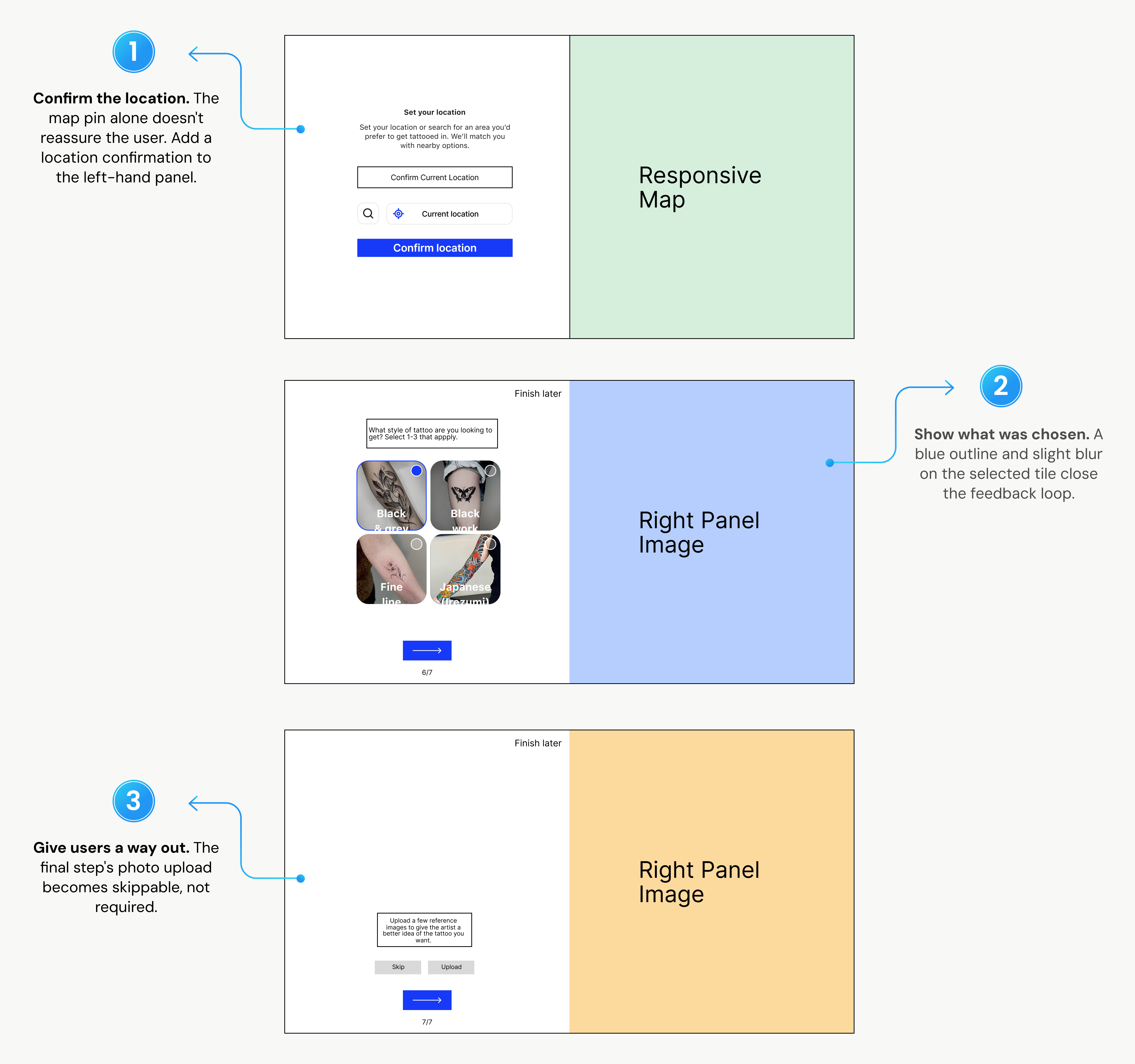
The thread connecting all three: a booking flow that respects hesitation completes more often than one that punishes it.
Tattoodo applied the findings directly to the platform. Location confirmation, the style-selected state, and the optional photo upload were all incorporated into the live booking flow. The product moved from a flow that collected user input to one that acknowledged it — making the digital booking of a permanent decision feel commensurate with the weight of the choice.
.png)
.png)